What’s the Beef? Taking a Bite Out of the Hamburger Debate
 I have a keen interest in hamburgers. They are not my favorite food … I am talking about the small, 3-lined menu icon that has been the topic of debate in the web design community.
The icon was designed by Norm Cox as part of the user interface for the Xerox Star – a “workstation” from the early 1980’s that was a precursor to the computers of today. The three stacked lines of this icon were meant to mimic the look of a menu list. In 2009, the hamburger icon was also used in Tweetie, Twitter’s first mobile app, but became more widely used after Facebook adopted it on its mobile version in 2008/9.
Today, this icon is widely used as a “button” in mobile views to indicate to a user that website navigation will be revealed when this button is clicked. It is also being used more widely on desktop website designs, which I generally do not think is a good design, and many UX, IA experts agree. Let’s digest some facts and opinions about this icon.
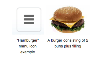
Image from Wikipedia
Do Users Know What It Is?
I heard Morten Rand-Hendriksen talk about hamburgers at a recent WordCamp. Morton is a UX guy (among other things) – he takes his phone out in shopping malls and has strangers play with websites, while he records their actions and reactions to different website components. In his presentation, he quoted a study by Moovweb, which indicated that the hamburger menu is clicked on 20% of the time and is one of the most popular mobile interactions measured; however there are many users who still have no idea what the hamburger menu is (Only 52% of users over the age of 45 were shown to know what the hamburger icon means). While to you it may seem obvious, to others, help is needed … which is why this study also showed that labeling the icon with the word “menu” can increase interactions by 61%. On top of that, surrounding the hamburger icon with a border, or giving it a background, so that it looks more button-like will result in more clicks.
A compelling article by Luis Abreu in Smashing Magazine refers to data that suggests that Hamburgers might be causing more harm than good.
So Why Do Designers Use It?
On mobile, of course, space is limited, and this icon has become the most widely recognized symbols to indicate a “menu.” Being small, simple, and minimal, the hamburger button frees up valuable space.
Many studies have shown that when given too many options, most people are likely to choose nothing at all. One particular study found that users are actually ten times less likely to act. So simplifying a design but hiding the navigation (or secondary navigation items) can help direct users exactly where you want them to go (if they want to go there!).
This same philosophy CAN apply to SOME instances of a desktop design. However, I believe this is rare.
Why You Should Not Use It – On a Desktop Design?
Out of sight, out of mind. Desktop design has the luxury of having more space, and therefore the ability to offer users more information to help direct them to where they want to go. This should not be sacrificed simply to have a minimal design. Hiding the navigation may look pretty, and make a designer and his/her client feel modern and mobile savvy, but if it makes it hard for users to find what they are looking for, it’s not a good idea.
Meredith Noble, of Catalyst, states that “although there is an elegance involved in creating a single design that is relatively consistent across all screen sizes, the difficulty is that as troublesome as hamburger menus are on mobile, they are arguably more troublesome on desktop.” She shares four great reasons why Hamburgers are not a good design choice:
1. HAMBURGER MENUS ARE A LAST RESORT FOR USERS
Catalyst’s user studies revealed that hamburger menus are consistently a last resort for users searching for a specific piece of content. Users will explore the body of a page before resorting to a hamburger menu.
They will force themselves to use what’s available in the body of a page, making many wrong turns in the process, when the answer to their problem is sitting there hiding in a hamburger menu.
2. HAMBURGERS MAKE EXPLORING A CHALLENGE
That out of site, out of mind problem … If you have content that users are unlikely to know exists, putting it in a hamburger menu is a bad idea. When options are hidden behind a button they become invisible until users take the additional step of clicking. Which is reason #3:
3. HAMBURGERS ARE INEFFICIENT
Hiding a full navigation structure behind a hamburger menu when it’s not necessary creates an extra click for users each and every time they want to navigate to a new section. The general rule is that users will not click more than 3 times/3 levels deep. In addition, on mobile, the button is often placed in the top left corner – the hardest place to reach when using the phone with just your right hand.
4. HAMBURGERS REQUIRE BRAIN POWER
Hiding information behind an icon forces users to remember where options are. This places undue load on a person’s memory. Recognition is easier than recall. Sometimes I get in a mood to reorganize my kitchen drawer contents. Soon afterward, no one in the family can find anything because it’s not where they are used to finding it … even for several times after I explain the new locations, they get lost and frustrated. We are used to seeing navigation for a website – don’t hide it if you don’t have to.
How and When Should You Use It?
Choose clarity over simplicity
In a 2014 article in The Atlantic, developer Carl Johnson says the hamburger debate is really a larger discussion about goals. We should be looking to simplify and clarify navigation, not hide it altogether. An article in Web Designer Depot says that designers need to fully embrace a mobile-first approach, and apply it not just to design, but to content and our information architecture.
@design_tlc @anthonydpaul From skimming it, sounds about right. Hamburgers are generally a bucket you throw shit into without thinking.
A good solution, which Facebook and other mobile apps have adopted, is the tab bar – a row of persistently visible buttons typically at the bottom of the screen that open different parts of the app. I believe we will see this approach used more widely in the near future. The Hamburger makes an appearance in these tab bars, often as the last item in the menu with the word “More” to be used for overflow items.
Do you want fries with that?
If you choose to use a hamburger icon, just make sure it is for the right reason, and done using best practices, with your user audience in mind. In time, this may become a non-issue as users become more familiar with it.