What Should Be On Your School Website Homepage
Your school website home page is often (but not always – more on that in a future blog post!) the first page people come across when they visit your website. It’s usually the page that gets the most attention during the website design and development process, with good reason.
We love designing home pages for schools! What’s not to love about featuring happy students, families and faculty? And often, we get to design home pages to replace outdated designs and photography, which gets the school community really excited, too.
There are a few really important things to consider when designing a school website home page. Here are 6 important things to keep in mind:
1. User-Friendly Navigation
Any website design/redesign should start with a review of the goals of the website, and careful thought about the pages and website “architecture.” This may involve reorganizing the pages and how they relate to each other. It may require some new pages and removal of pages that are not relevant (be sure to create redirects if you delete pages!)
A goal of any website should be to make it easy for users to navigate and find what they need. This should direct the design. Don’t sacrifice usability by making a design that is “cool” but does not consider the user experience. Navigation on a school website can be complex, with content for enrolled families and prospective families. Hiding navigation off-screen, requiring extra clicks or a knowledge of trendy icons to find things will not serve your school website users well.
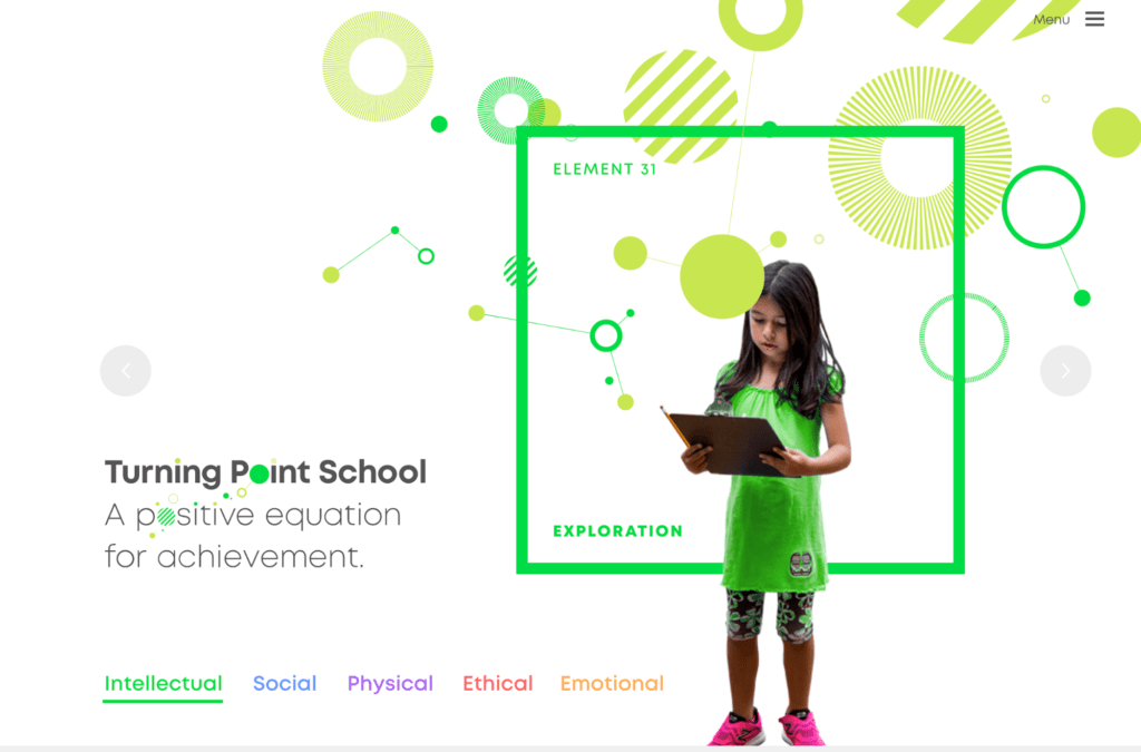
The Turning Point School has some engaging photography and animation, but the Menu is so hidden in the upper right corner, it takes an effort to find basic information, and there is no Call To Action (see #3 below)
As consumers of internet content, we are accustomed to seeing a horizontal menu, often with a page called “About” and the last link to the right being “Contact.” Don’t name things too creatively. Make your content easy to identify and put it in a logical order that follows a convention users will be familiar with.
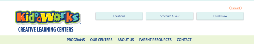
The navigation on the KidWorks website is very clean and organized. The Calls to Action are easy to find in the quick link buttons, and the Contact link is where we expect it to be.
2. Messaging
What makes your school different? How will you solve a prospective student’s problems? What are people looking to learn or solve when they come to your website?
The main message, or headline, on your website, should not be a fact or brag statement about your school. It should answer the question your website visitors want to answer. This should be a single message, not multiple points you are trying to make in one place (see #4 below). Work with your team to interview your families and students to help you identify your main unique selling proposition (USP). How can you help them?
Consider the difference between these two statements:
“Our School Has a 5:1 Student to Teacher Ratio”
“Make a Big Difference In Your Child’s Education with Small Class Sizes”
3. Call To Action
Once you have the attention of your website visitor, give them a way to act upon their interest. For schools, a common call to action is to schedule a visit, sign up for a tour or fill out an inquiry form. Be sure to set up goals in Google Analytics so you can measure the success of your call to action.
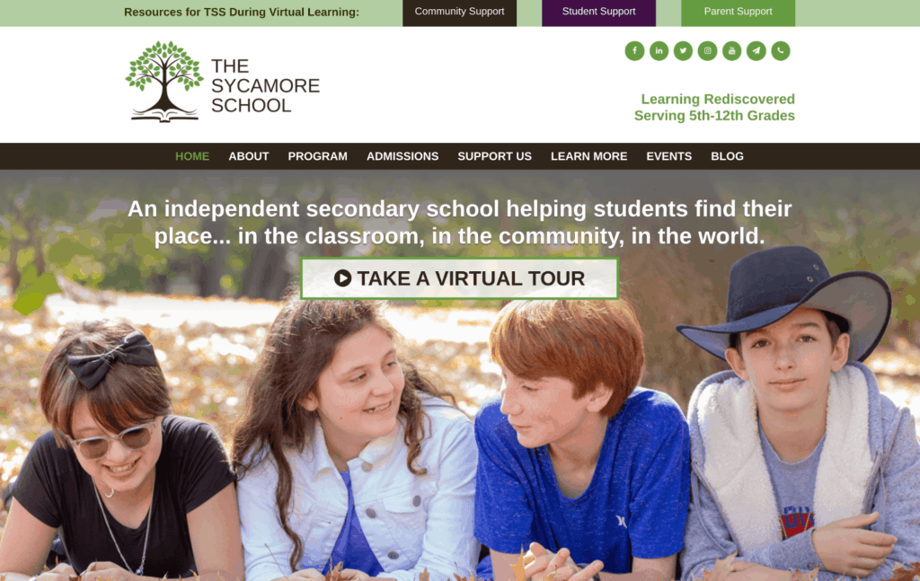
The Sycamore School asks visitors to take a Virtual Tour of their school, since we are currently in the time of the COVID Shutdown. When schools open back up, this call to action will ask the visitor to sign up for an information session.
4. School Website Homepage Hero Image
Most websites have what is referred to as the “Hero Image.” This is the featured image or video at the top of the homepage. This is a great way to grab a visitor’s attention – and also a great way to slow down your website or lose your visitor. Be sure that your school website homepage hero image:
- Is a high quality image that matches your message
- Depicts the character of your school
- If it is a video, make sure it is not too busy, moves too fast or has sound that plays automatically. Video can be cool, and it can be effective, but it should not be used if it is not well done and if it is not hosted on a server that does not slow down your site. Does the video ADD to your message or does it distract from it?
- If you have a rotating carousel of images, limit them and know that research shows that people DO NOT watch sliders. If you want to have multiple images rotating or fading, do not put different messages on each slide, as these messages will not be seen by most visitors. It is better to put supporting messages in another place on the home page to ensure they are seen. You should have ONE main focus message in the hero area/headline.
5. Portals
Many schools use a separate platform for an application and enrolled family portal. Make sure this link is easy to find in the navigation or header area, and that it opens in a new link.
6. Events
It is a good idea to feature upcoming events or your school calendar on your school website homepage. This is content enrolled families often look for on a website, and it makes it easy to find if it is on the home page.
Don’t try to be too fancy! You are better off having a clean, easy to use website without bells and whistles that may distract from your message and often don’t work on all browsers, or can cause issues for people with disabilities, who have physical reactions to lots of moving parts and sounds.
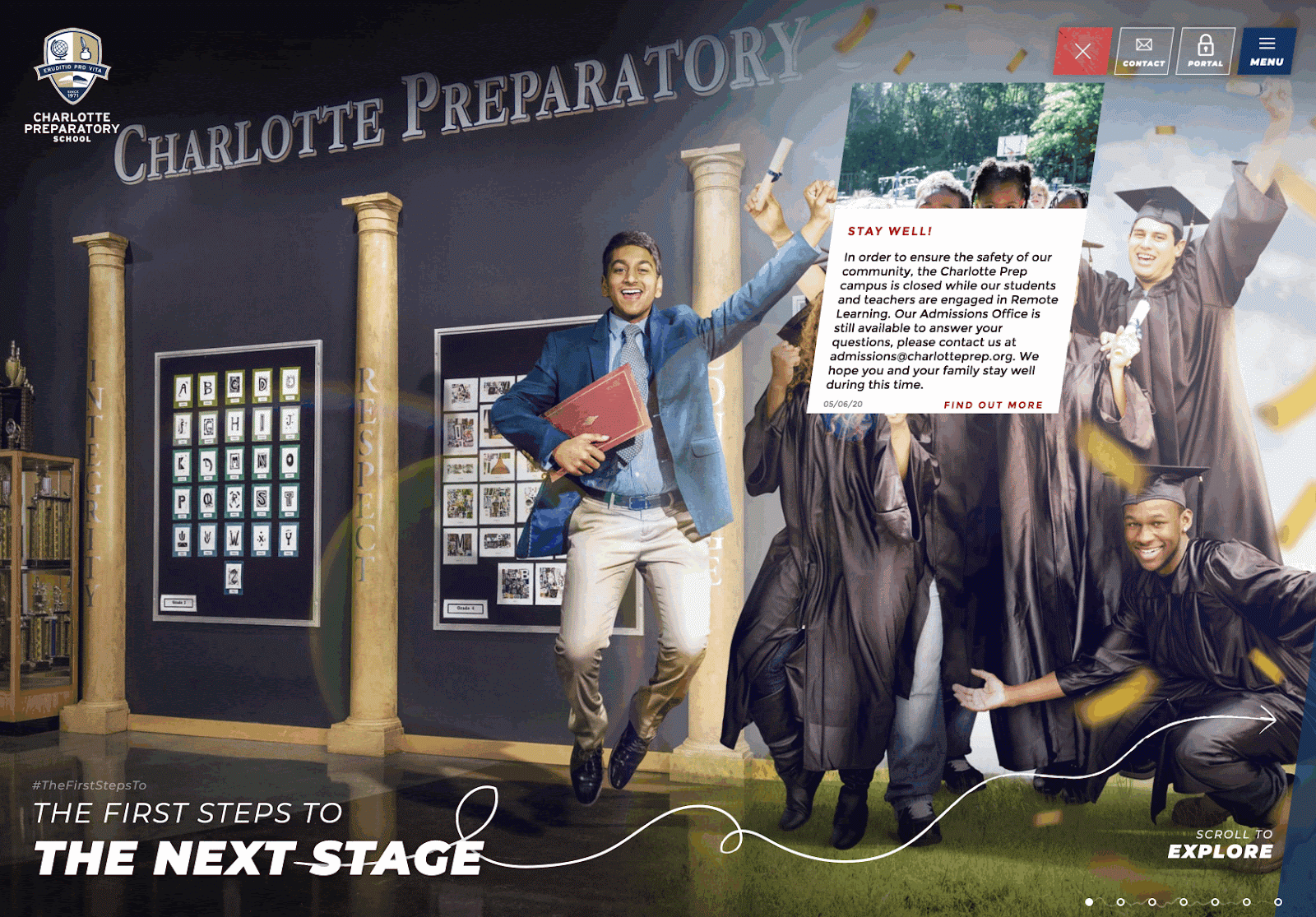
While this award-winning website for Charlotte Preparatory School is cool and meant to be interactive, it is hard to figure out what to do to navigate through the content, the main navigation is hidden and then covers the whole screen and it is nearly impossible to find what you may be looking for. And, when loading the site, or switching between pages, you have to watch a “loading” message and icon for a few seconds – maybe longer depending on your browser, device, and internet connection.
We are always happy to give some feedback on website home page design and content! Reach out for a free consultation and to learn how to make improvements to your school website homepage.