What Makes a Nonprofit Website Successful?

We specialize in WordPress nonprofits websites. Identifying goals, creating a positive user experience, communicating key messages and solving problems are the basis of the work we do. When it comes to nonprofit websites, we break the site down into 3 main areas of strategic focus: Design, Content, and Technical Structure. Within each area, we identify key elements to address in the development of a new or refreshed website. Check this list to see if your nonprofit website needs improvement:
Nonprofit Website Design
Easy To Use and Read
Show your website to someone not familiar with the site or your organization. Ask them to find some important pieces of information, such as your location, mission, contact information. See if they can easily navigate to content on the site and make notes of anything they can’t find or that is confusing. Test this with people on a desktop as well as on a phone.
Call To Action
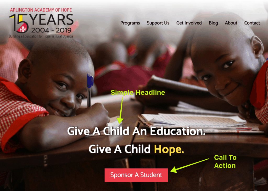
You are missing out if you do not have a call to action near the top of your website. We often see a long, descriptive headline or sentences of text in the top area of a site, rotating in a slider. This does not promote action. Research shows that people do not watch or read messages on carousel sliders, and if there is not a single, simple focus, visitors to the site are less likely to know what to do. Make it easy and obvious with a button and a clear call to action, with a simple, powerful headline.

F Layout
The F-Pattern describes the most common user eye-scanning patterns when it comes to blocks of content. This pattern is a problem for web design, where important information can be missed when a user is scanning quickly. In response to research done on the F-pattern, The Nielsen Norman Group recommends:
- Include the most important points in the first two paragraphs on the page.
- Use headings and subheadings. Ensure they look more important, and are more visible, than normal text so users may distinguish them quickly.
- Start headings and subheadings with the words carrying most information: if users see only the first 2 words, they should still get the gist of the following section.
- Visually group small amounts of related content — for instance, by surrounding them with a border or using a different background.
- Bold important words and phrases.
- Take advantage of the different formatting of links, and ensure that links include information-bearing words (instead of generic “go”, “click here” or “more”). This technique also improves accessibility for users who hear links read aloud instead of scanning the content visually.
- Use bullets and numbers to call out items in a list or process.
- Cut unnecessary content.
Imagery, Fonts, Colors and Logo
A study by the Harvard Business Review on people’s online purchase decisions found that consumers tend to rely more on intuition than on deliberation. This means things like images, colors, and fonts have a significant impact on how people will respond and act on a website.
Make sure your images are high quality and convey a welcoming, friendly tone to invite visitors into your website content. Choose colors and fonts that are easy to read and that complement each other as well as your logo. Speaking of you logo, that should be an element that is fresh and crisp, not out of date and blurry.
Strong Copywriting
It often benefits an organization to hire a skilled writer who has experience in creating well-written, conversion-oriented writing for charity websites. A “good writer,” journalist or novelist may not be the best fit, when you need messaging that is concise and compelling and which gets to the mindset of the website visitor to answer their questions or identify with their interest in supporting your organization.
Nonprofit Website Content
Beyond the layout and design of a website, the meat of what is there – the content – is extremely important. Here are some content considerations for nonprofits to keep in mind:
Legitimacy
A Harvard Business Review concluded that trust is essential to forming an intention to purchase or donate online. We encourage testimonials, documentation, industry reports, and financials be included on nonprofit websites.
Photography
Adding to the trustworthiness of your site, you should include photos of events, your organization in action, members. Authentic photography makes a website more authentic. There are times when stock photos are needed, however, stock photos should be kept to a minimum.
Benefits & Mission
Clearly communicate benefits of donating and where the money goes. This may seem obvious but is often overlooked. Share with website visitors what you are about, what your mission is and your history.
Must Have Pages
Be sure your website includes these pages (and more) Home, About, Donate/Join, Events, Contact.
Technical Specifications for Nonprofit Websites
.org
It is a standard practice for nonprofits to use .org as their TLD, or Top Level Domain. While .org is not restricted to nonprofits, it is widely used by these organizations. Using .org for your website domain can make it easier to identify as being a nonprofit and may even lend some credibility to your website.
Make Donations Easy
Of course, if it isn’t easy or obvious how to donate on your website, you will lose opportunities. Make sure that your Donate button works, and that payments can be submitted online easily and securely. Also be sure that you receive notifications of donations, and that the appropriate thank you message and and IRS receipts are sent and accessible by donors.
Donation Form
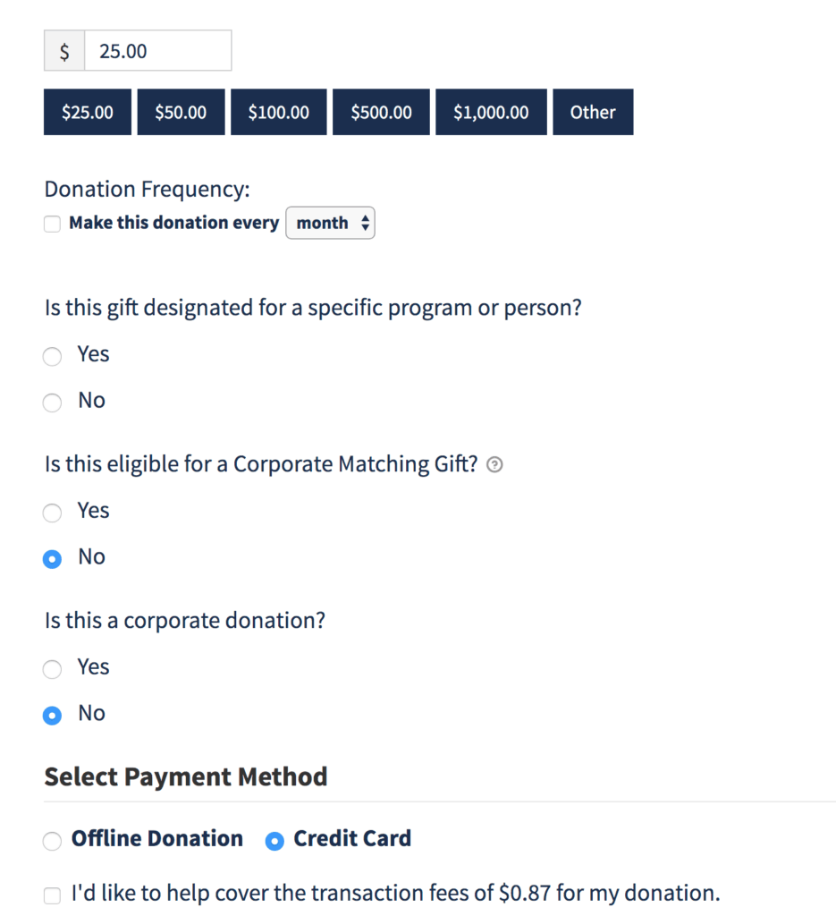
When it comes to your donation form, keep it simple so people can make a donation quickly. Also consider these options to include in your donation form, if possible:
- Fee recovery (to cover credit card and/or other processing fees)
- Designation
- Corporate Matching
- Gift in Honor of with ECard to giftee
- Direct Credit Card on site (vs. exiting to PayPal site or other 3rd party site)

Also, be sure to allow people to send a check via snail mail and to contact you with questions. People making larger donations may prefer to do so by check rather than online.
Make it Mobile Friendly
Over 50% of visitors to most websites are visiting on their smartphones. In 2018, Google made a “requirement” that websites be mobile friendly in order to satisfy searchers. They know what users of the web are doing and looking for, so this change has resulted in many websites being updated to serve a version of their website in a way that makes it easier for mobile users to view and interact with the site. Read this post if you are not sure what mobile friendly means.
SSL
Similar to their Mobile-Friendly requirement, Google also wants website to have secure communication between the user and the website. We wrote a blog post here about SSL Certificates. You can check to see if your charity website is secure with an SSL by looking in the browser bar to see if it has “https://” instead of “http://” or if it has a green lock icon or a message that says “Not Secure.” Even if you have an SSL on your site, be sure that the content on the page is loading over https, or the page will show as insecure due to this Mixed Content error.

Fast load speed
Maile Ohye from Google says, “2 seconds is the threshold for ecommerce website acceptability. At Google, we aim for under half a second.”
A fast site is a good user experience (UX), and a satisfying UX leads to more donations. If your site is slow to load, or gets “stuck” people will abandon the site and will not return. Here are some tips on how to test and speed up your website.
Reviewing Data To Determine Success
How can you really know what makes YOUR nonprofit organization website successful? After you have made improvements to the design, content and technical aspects of your website, it is important to monitor results. Are your donations going up? How is your website traffic? You can set up Goals in Google Analytics to measure how many people are going to your donation form and how many people are following through with a donation. There is a lot you can learn from reviewing results, and then making adjustments to improve your donations on your nonprofit website.