The League of American Bicyclists
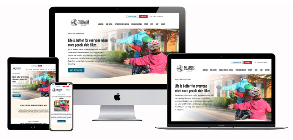
How We Built a New User-Friendly Nonprofit Website
Converting the Website from Drupal to WordPress
The League of American Bicyclists’ previous website was built on the Drupal platform. The design was out of date and was not very user-friendly. To improve the user experience for front and back end website users, we converted the website to WordPress, a more flexible and user-friendly content management system.
Consistent, Updated Branding Elements
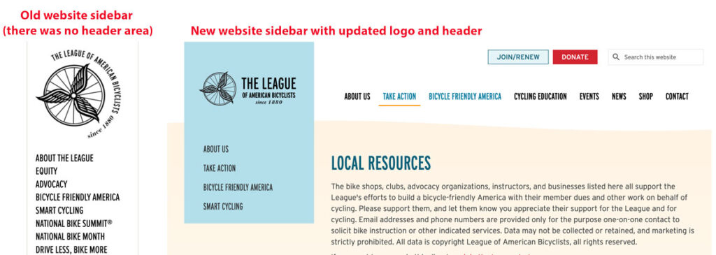
The League has a comprehensive Branding Style Guide. We honored the brand fonts and colors to maintain consistency. We created a horizontal version of the logo which is more readable. The logo is a wheel with the name League of American Bicyclists wrapped around it, making it hard to read, and taking up a lot of vertical space in the header. The new logo has the same wheel icon, and breaking out the name was a good improvement without damaging the brand. The style guide also refers to a “hanging flag,” a vertical section which contains their logomark and should be hanging from the top edge. This was used for the website navigation on the old website, which had no header area and the sidebar navigation was hard to use, because there is so much content on the site. We created a user-friendly header area, making navigation familiar for website users, and then maintained the left sidebar navigation for internal section menus from their old site to create some familiarity and consistency for users of the former website.
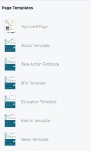
Custom Templates in Beaver Builder
We used custom templates in Beaver Builder to make it easy to create new pages and maintain consistency across the website. This allowed for a more streamlined website-building process, which was particularly important for a nonprofit website with a lot of content. We created a page template for each section of the website, which includes the proper sidebar internal navigation.
Adding Fun Animated SVG Graphics
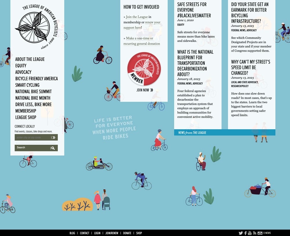
To add a playful element to the website, we created animated SVG Lottie Files of bicycles riding across the page. This reinforces the League’s mission of promoting bicycling as a fun and healthy mode of transportation.
Creating a Custom Map Integrated with Salesforce
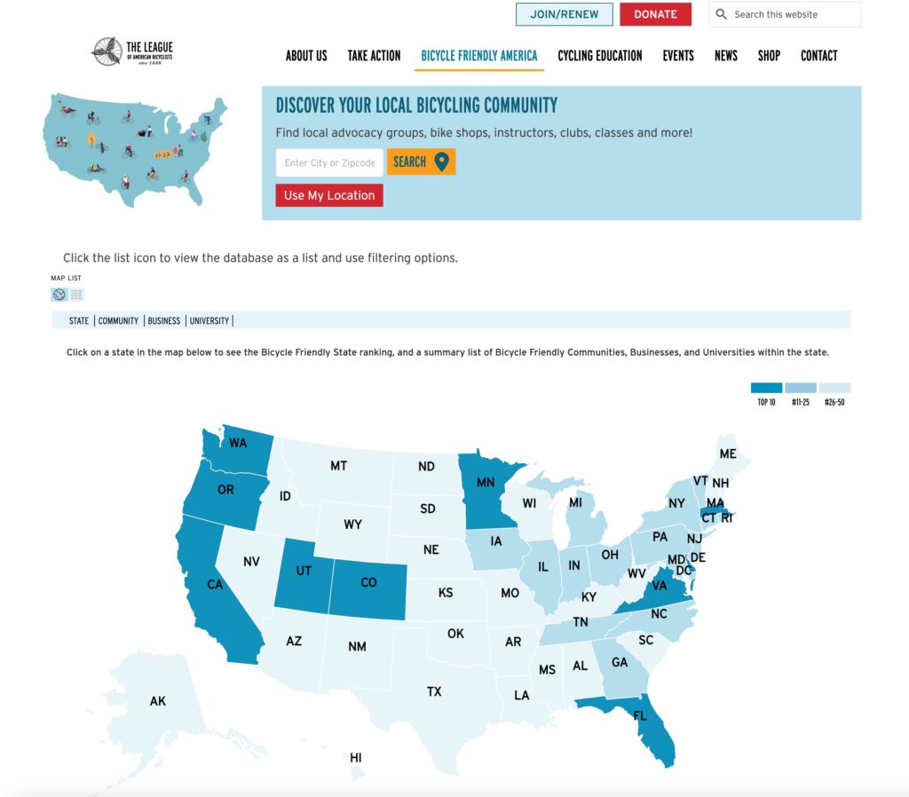
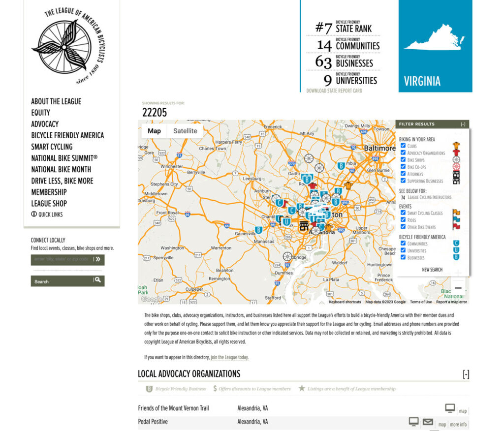
One of the key features of the new website is the map, which was custom-developed to integrate with Salesforce. The map shows the locations of League members and bike-friendly businesses across the country, and we made several improvements to make it more visually appealing and user-friendly. The old map was very cluttered with blurry icons and a filter that covered the map. There was a big blank area at the top of the page, and the map did not include bike trails.
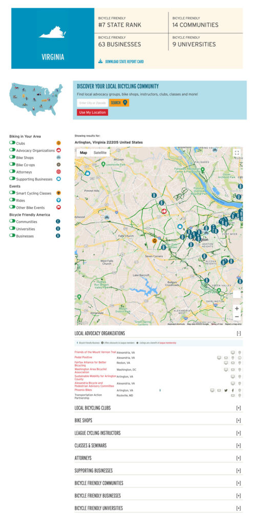
Senior Developer Tom Ransom did an amazing job of thinking through every detail of the map process, including using the map API feature that displays the version of a map with bike lanes. The result is a user-friendly, easy-to-navigate map with filters, “Use My Location” and integration with the Bike Friendly America resources.
New website map page
Former website map page
Bicycle Friendly Award Database Map on New Website
(click image to view live webpage)
Meticulous Content Transfer
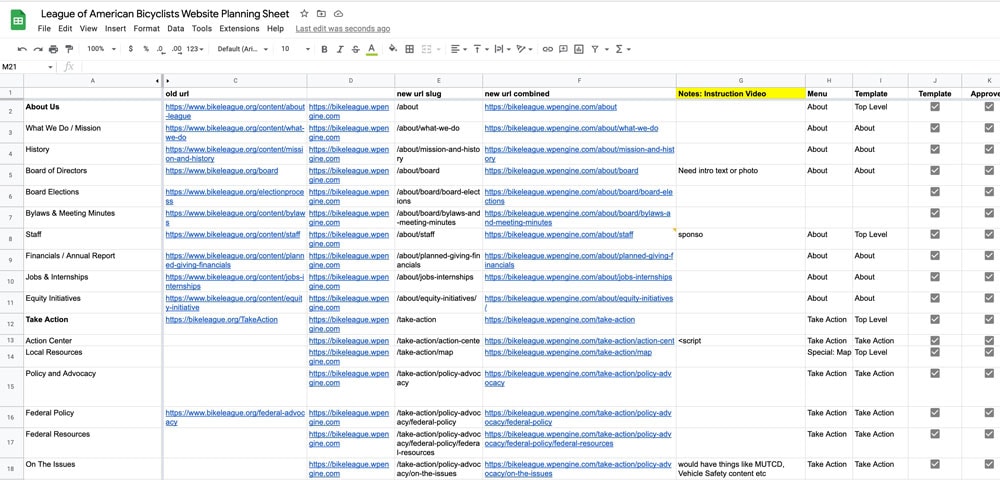
The League’s old website had content going back to 2010, so it was important to be detail-oriented in transferring the content to the new website. Our team was meticulous in this process to ensure that the new website would be comprehensive and useful to users.
Supporting a Good Cause
Tara Claeys, the owner of Design TLC, has been involved in her local cycling community for many years and was thrilled to work with an organization that shares her passion for bicycle advocacy. Design TLC is proud to have created a nonprofit website that supports the League’s mission and makes it easier for people to get involved in promoting bicycle safety and accessibility.

Design TLC’s work on the League of American Bicyclists’ new website is a prime example of how we work with nonprofits to make the world a better place. By converting the website to WordPress, using custom templates in Beaver Builder, integrating with Salesforce, and paying close attention to content transfer, Design TLC has created a user-friendly and comprehensive nonprofit website that supports the League’s mission of promoting bicycle safety and accessibility.
Contact us to learn more about how we can help your nonprofit improve your website.
Objective
- Migrate from Drupal to WordPress: Convert the League of American Bicyclists’ outdated Drupal website to WordPress to improve usability and backend management.
- Ensure Brand Consistency: Maintain brand fonts, colors, and style guide elements, while optimizing logo readability and navigation design.
- Enhance User Experience & Navigation: Create a modern, user-friendly navigation system while preserving key elements from the old site for familiarity.
- Develop Custom Templates for Efficiency: Use Beaver Builder templates to streamline page creation and ensure layout consistency across the website.
- Improve Map Functionality & Salesforce Integration: Redesign and integrate a custom interactive map that displays League members and bike-friendly businesses, improving usability and visuals.
- Optimize Content Transfer & Organization: Carefully migrate and structure over a decade of content (from 2010 onwards) to ensure seamless access to valuable resources.
Approach
1. Drupal to WordPress Migration
- To improve the user experience for front and back end website users, we converted the website to WordPress, a more flexible and user-friendly content management system.
- We improved content management, making it easier for staff to update and maintain.
2. Branding & Navigation Updates
- Honored & maintained brand integrity by following the League’s Style Guide for fonts and colors.
- Created a more readable horizontal logo while retaining the original wheel icon.
- Redesigned site navigation, replacing the outdated hanging flag sidebar with a clear header navigation bar, while keeping internal section menus for familiarity.
3. Custom Templates & Page Building
- Developed custom Beaver Builder templates for each website section, ensuring consistent layout and easy content updates.
- Designed sidebar templates for internal navigation, improving accessibility for users.
4. Interactive Map & Salesforce Integration
- Redesigned the map to display League members and bike-friendly businesses across the U.S.
- Integrated the map with Salesforce, improving accuracy and real-time data updates.
- Enhanced user experience with bike lane map overlays, improved filters, and a “Use My Location” feature.
5. Visual Engagement with Animated SVG Graphics
- Designed animated bicycle graphics using Lottie Files to reinforce the League’s mission and add a dynamic element to the website.
6. Meticulous Content Transfer
- Carefully migrated content dating back to 2010, ensuring no loss of critical information.
- Organized and structured the content for better readability and usability.
Outcome
- Improved Website Functionality: The migration to WordPress has made content easier to manage, with a modern backend and better scalability.
- Stronger Branding & Readability: The redesigned logo and navigation system enhance usability while maintaining League branding.
- Seamless Navigation & Layout Consistency: Custom Beaver Builder templates provide a structured, easy-to-maintain layout, making the website more intuitive.
- Enhanced Map Experience: The interactive map now offers better visuals, Salesforce integration, bike lane overlays, and user-friendly filtering.
- Increased Engagement & Visual Appeal: Animated Lottie bicycle graphics add a playful, engaging element to the site.
- Preserved & Organized Content: Over a decade of valuable resources was meticulously transferred, ensuring a comprehensive and well-structured website.
