Easy Improvements For Better School and Nonprofit Website Performance
Before we delve into the specifics of enhancing website performance, it’s crucial to revisit a fundamental rule of website design. The allure of adding numerous bells and whistles to your website, such as videos, animations, and flashy elements can be tempting. However, these embellishments can potentially lead to a negative user experience if not executed properly or if they lack a clear purpose.
Imagine a visually stunning, flashy, expensive car that only accommodates one person, achieves a mere 2 miles per gallon, and hides its ignition button under the dashboard, with the gas pedal and brake oddly placed on the ceiling. While it may look impressive in a parking lot, it’s incredibly challenging to reach your destination in this vehicle!
Now, consider a dependable, new car that exudes quality without the flashiness or extraordinary cost. It boasts excellent gas mileage, maintains highway speeds, comfortably seats your entire family, and features a dashboard and pedals in familiar locations. This is the kind of car most people prefer to get them where they need to go. The same principle applies to website design for schools. If your website’s primary purpose is to swiftly and easily deliver information to prospective and current families, excessive frills are unnecessary. And even if you do decide to incorporate some fancy elements, ensure they do not hinder the website’s performance or user experience.
Website Performance
Website performance encompasses many different elements. In this blog post, we will explore four primary performance categories. It’s essential to keep in mind that overall performance directly influences user experience, which, in turn, affects how visitors engage with your website and whether it helps your organization achieve its objectives, such as inquiries, applications, and donations.
User Experience
Let’s begin with the cornerstone of website performance: User Experience, commonly referred to as U/X. User Experience encompasses various aspects, including mobile responsiveness, accessibility, and design (which we will discuss later). For now, let’s focus on two areas of user experience/website performance where websites often fall short: navigation and speed.
Navigation
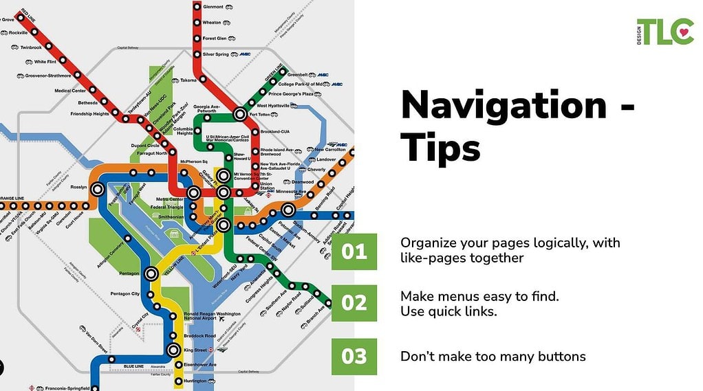
Effective navigation is characterized by its familiarity and ease of use. Research shows that website users tend to follow an “F” pattern when scanning content, starting in the upper left corner and moving horizontally, similar to reading a book. Consequently, most websites position their logo or name in the upper left, followed by the menu to the right, and beneath these, from left to right, they place their message and call to action.

Your site map impacts your website navigation, so start there. Organize your pages to group content into sections, such as “About,” “Admissions,” “Giving,” “Academics,” etc. use dropdowns in your navigation to present these pages clearly and logically. Use Quick Links if necessary to group your most popular content in and easy-access location
Avoid the following navigation mistakes:
- Having too many top-level pages. Organize content into logical “silos” with dropdowns under top-level pages to emphasize important pages.
- Using the “hamburger” menu icon on desktop versions of websites, which makes the user work harder than they should on a computer to quickly find and access the information they are looking for.
Website Speed
Google’s research has revealed that 53% of mobile website visitors will leave if a site fails to load within 3 seconds. Imagine, your website has just three seconds to capture a visitor’s attention!
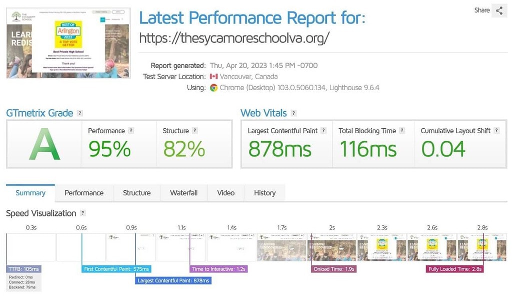
Assessing your website’s load speed is crucial. You can use free tools like GT Metrix to test your website’s load speed. This tool provides valuable data on potential slowdown factors and offers recommendations for improvement. The most common cause of a slow website is large images that are not optimized, or large videos. Be sure to properly size and optimize your images before loading them onto your website.
Performance Matters
GT Metrix assigns an overall performance grade, and this is where that flashy car gets put to the test. Let’s consider two school websites: one has won design awards and features captivating imagery and dynamic elements, but it takes nearly 19 seconds to load, and sometimes it fails to load within measurable timeframes. The lesson here is clear—you can have a visually appealing website that loads quickly; you simply need to strike the right balance between aesthetics and speed.

Site Speed Tips
Here are some straightforward tips to enhance your website’s speed without delving into complex code or server configurations:
- Optimize all images using a photo editing tool or resources like tinypng.com.
- Avoid hosting video files directly on your website server.
- Regularly check for broken links.
Errors
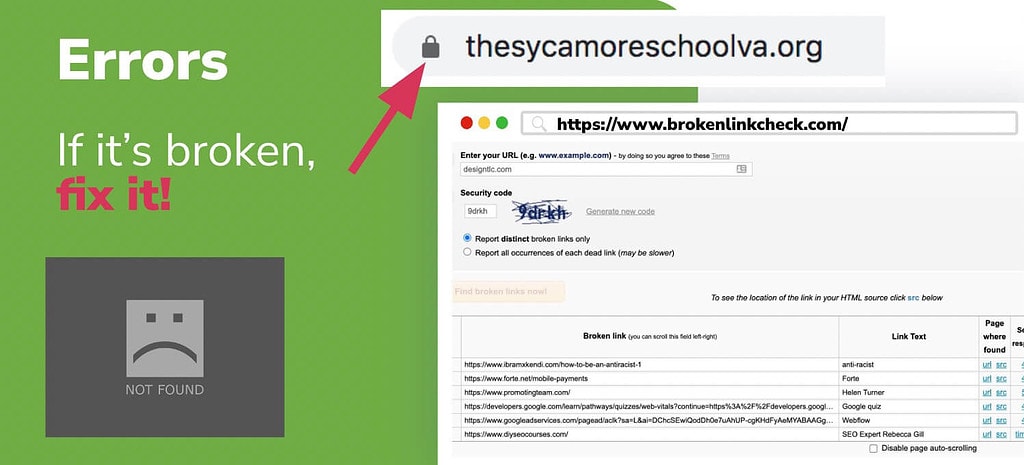
If it’s broken, fix it! Errors on your website can frustrate visitors and tarnish your organization’s image. Two common errors are the “not secure” warning and the “404 not found” page.
Insecure Websites
An insecure website lacks an active SSL certificate, a small piece of code added to your domain/server that encrypts user-entered information, such as contact form submissions. Google has mandated SSL certificates for a few years now, and most hosting services offer them for free. Ensure your SSL certificate is active and your website is secure.
404 Errors/Broken Links
A “404 not found” error indicates missing content on your website, often resulting from changes to page URLs without proper redirection. Utilize tools like Broken Link Check to crawl your website and identify broken links for prompt correction.
Content Errors
Another type of error to watch out for is outdated information on your website, including events, news, statistics, tuition details, staff profiles, and calendars. Be sure that your important content is not out of date to avoid confusion among website visitors. Remember your website is often the first impression someone has of your organization. Old and incorrect information leaves a bad impression.
Form Notifications
Test your forms periodically to ensure they function correctly. Errors in forms or form notifications can adversely impact your website’s performance. When visitors fill out forms, it’s crucial that you receive timely notifications. Additionally, the post-submission message should be relevant to their submission to leave a positive impression.
HTML Markup
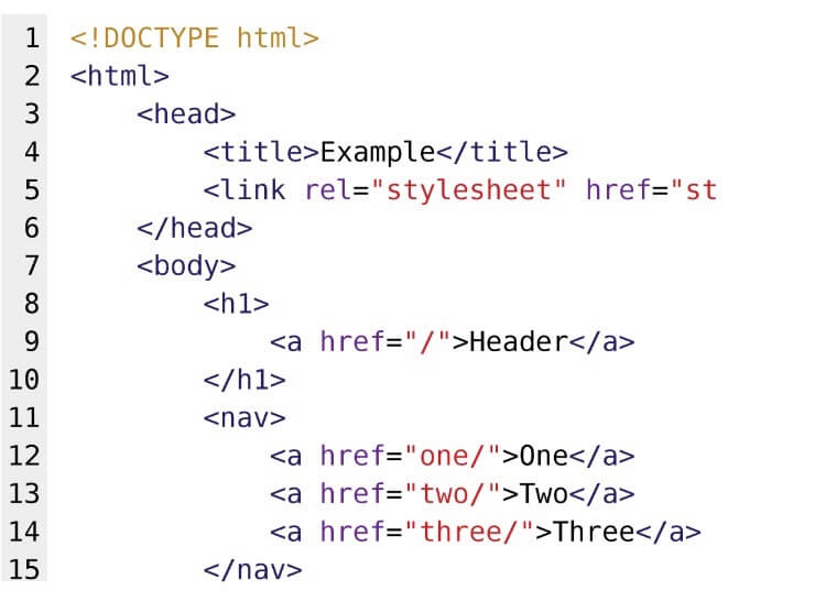
Lastly, pay attention to incorrect HTML markup, which can negatively affect website performance. You don’t need coding knowledge to address this issue. Heading styles like H1, H2, and H3 serve as essential cues for both Google’s algorithms and screen readers. Ensure that your website uses H1 sparingly, typically reserved for page titles (one per page), with H2 and H3 appropriately indicating content hierarchy. Note that these are NOT design style elements. You can have a very small H1 line of text and a very large H2 headline – for example the page title GIVING might be a small heading above a large, more compelling subheadline like WHY YOUR DONATION MATTERS.
Check Your Website Regularly For Performance and Errors
To ensure that your website consistently performs at its best and that your content remains current, we strongly recommend scheduling regular check-ins. Consider adding a monthly website review to your calendar, dedicating 15-30 minutes to this essential task. During these check-ins, focus on the following:
- Website Speed: Assess your site’s loading speed to guarantee a swift and seamless user experience.
- Broken Link Check: Conduct a thorough scan to identify and rectify any broken links that may hinder navigation.
- Content Updates: Review your most critical content areas to verify the accuracy and relevance of the information. Additionally, periodically refreshing your website with new photos can provide a fresh and engaging appearance.
To help you stay on track, you can create a recurring calendar event using this link: Website Check-In Reminder.
Design & Messaging Impact on Website Performance
An appealing and user-friendly design is pivotal to a successful website. Here are some key considerations regarding images, colors, fonts, and text:
Tips for Photos:
- Focal Point: Ensure that each image has a clear focal point to capture your audience’s attention effectively.
- Text Overlay Placement: Be mindful of text overlay placement; it should not obstruct essential elements of the image.

- Alt Text: Always include descriptive alt text for images to enhance accessibility and SEO.
- Optimize Size and Resolution: Optimize your images by resizing and adjusting their resolution to improve loading times without compromising quality.
Color & Fonts:
- Brand Consistency: Maintain consistency in your color palette and fonts to reinforce your brand identity. Aim for no more than two to three fonts and colors to create a cohesive visual identity.
Text:
- Text Alignment: Avoid centering paragraph text, as it can disrupt readability. Instead, align text to the left or justify it for a cleaner look.
- Line Length: Limit the line length of your text to approximately 50-60 characters to enhance readability. Centered text can cause the reader’s eye to constantly shift, making it less user-friendly.
In conclusion, good website performance doesn’t require flashy elements; instead, it demands a focus on user experience, speed, error resolution, and meticulous attention to design and messaging. Prioritizing these factors will not only improve your website’s functionality but also enhance the user’s journey and contribute to achieving your school or nonprofit organization’s goals for your website.