4 Great Private School WordPress Website Designs
There is a different level of scrutiny that is involved because private schools are under more pressure to create compelling, interesting websites in comparison to public schools. In general, private schools are more competitive than public schools in terms of creativity and design, and it shows in their websites. Because private schools are concerned with their online marketing and enrollment funnels, a great website should be a huge priority to increase conversions and boost enrollment.
There are certain criteria that school websites must meet to be deemed a strong website. Some of these are a simple: savvy design, interactive site elements, an easily-navigated site, great organization, and plugging in links to social channels, and the list goes on.
We create effective, professionally designed websites for private schools; check them out in our portfolio. There are lots of other excellent school websites out there, too! Here are five school websites we love (and they are all built with WordPress).
Turning Point School
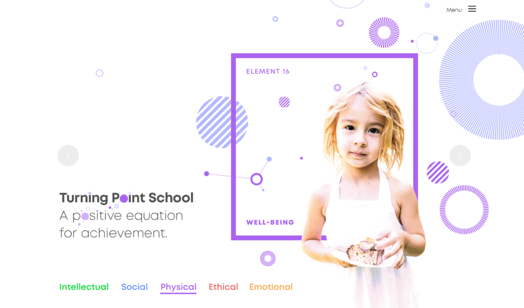
Turning Point School (located in Culver City, California) has a clean, functional website design with fun colors and memorable elements like small floating circle designs. Off the bat it’s plain to see that the website design values engagement and creativity, as it’s incredibly colorful. As you scroll down through the homepage, there are interactive blocks that separate the different age groups the school offers education for. Additionally, the menu is easy to navigate. Though this site design is unique, it is still clean and can be navigated simply.
One factor to note about this site is the strong original photography, and how there are plenty of pictures of students on the homepage. Having original photography shows your audiences more of your school culture.
Mastery School of Hawken
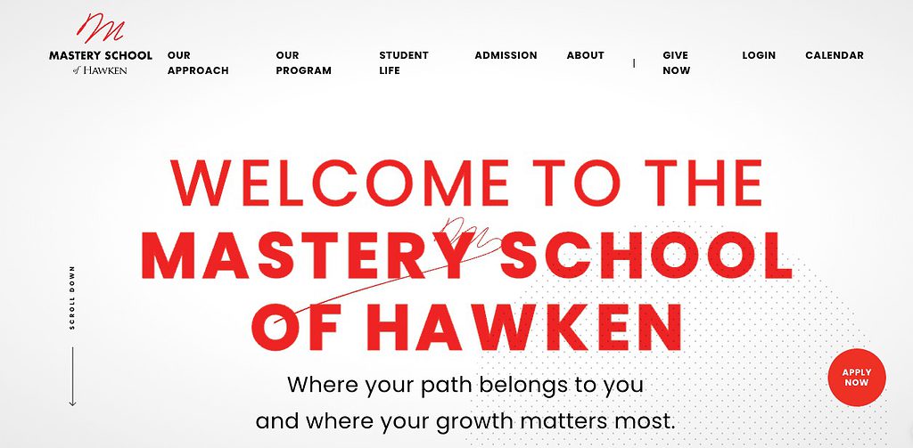
Located in Cleveland, Ohio, the Mastery School of Hawken has a fresh, interactive website that has a lot to offer on the homepage. One of the first elements to notice is the bold color scheme that automatically draws your eyes in. The strong red color showcases the school values; it is incorporated into the website design. We love the animation, which is wonderfully unique and memorable.
Though this website has a lot of moving and interactive elements, the site still loads quickly and is not distracting. It’s incredibly frustrating to visit a website that has too much video, jumpy action or hard to understand animated elements. Additionally on the Mastery School site, there’s a call to action on every page, which is crucial for engaging your school audiences and boosting conversions.
Grove School
A great addition to any private school website is multimedia elements, like video. Videos are great way for parents and families to get an inside look at your school, if done properly. They are a fantastic way to brand your school’s community and values, and can be very persuasive. Grove School is a great example of a private school website that prioritizes multimedia on its homepage.
This Madison, Connecticut school’s site is user-friendly and can be easily navigated with the horizontal menu at the top of the page with links to key content. The school’s homepage shows links to school calendars and events and provides plenty of information. The bottom half of the homepage has an engaging masonry-style photo grid.
While we like the engaging photos, the title text for each link is not easy to read. This part of the homepage needs some attention, but Grove School’s site is still a great example of plugging in multimedia where it counts.
Cambridge Friends School
Like the above website examples, Cambridge Friends School (located in Cambridge, Massachusetts) shows great design ability through their strong imagery and bold headings.
The shuffling gallery of hero images on this website easily catches the attention of website visitors. With the large featured text on the hero image, it’s impossible to not learn the core values of the school.
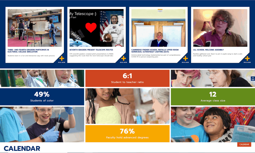
The webpage is organized to show ages the school educates, school news, school statistics, and the calendar. Though this is a lot of information and it’s both colorful and interactive, it doesn’t overwhelm the user because it is clean cut and relatively simple.
Additionally, the horizontal drop down menu continues to drop down in a submenu for subtopics, making the user feel like the overall website is organized and well kept. Each page is organized in the same fashion with the same color scheme, making the branding of this website unified as well.
Contact Us
Wondering how your school website measures up, or how to make it better? Now is a great time to give it a closer look and consider some updates and design enhancements. Contact us today for a free 15-minute consultation where we can discuss your priorities and discover how we can reach your goals together.