When Should You Use Accordions on Your Website

Using accordions on a website can make the content easier to read at a glance and avoid overwhelming a website visitors with too many words. However, it should not be overused as accordions can also make a website harder to use by forcing too much clicking to access important information. Let’s get an overview of the use of accordions in website design!
What is an accordion in web design?
An accordion is a list of headers that hide or reveal additional content when selected/opened. You may see them often on FAQ pages, where it makes it easy for users to scan the list of questions without getting distracted by answers and a lot of text, and giving them control by clicking on the questions that pertain to them.
Make your website content easy to read
How many times have you looked at a website and felt overwhelmed by too many words? Before we dive into website accordions, we need to review the goal of making your website easy to use and easy to read. It is true that too much content can be hard to read, but your website still needs to have a good amount of content for someone looking for more information and for Google to know what your website is about. Even if you have a lot of content, if the text is broken into small sections made up of the heading and then smaller, more detailed text, the content can be easily scanned and then read more completely as needed. This can also improve your website SEO if you use keywords in the sub-headings. By contrast, not only are long sections of text with no breaks hard-to-read text, this could also impact your bounce rate because visitors will leave your site if they can’t grasp what it’s about or find what they need quickly.
While many people think that website visitors will not scroll through a page if there is a lot of content, research shows that users do scroll when the content is relevant, organized properly, and formatted for ease of scanning. In fact, the standard scroll wheel on a mouse, arrow keys, and track pads have made scrolling much easier than clicking to open up tabs and accordions.
When to use accordions on your website
There are 3 general principles that should be considered when using accordions: reducing cognitive load, increasing readability, and clarity. Accordions are most appropriate when users will only need a few specific pieces of content within a page or if you have only a small space to display a lot of content.
According to the Nielsen Group,when used properly, accordions offer benefits to the user experience, including:
- Collapsing the page minimizes scrolling.
- The headings/accordion titles serve as an at-a-glance view of the most important content of the page. This allows users to form a mental model of the information available.
- Hiding (some of) the content can make the web page appear less daunting. Simplifying information for the reader helps the user stay focused. This is because the user is missing only the parts that are difficult to process. The longer the content, the more effort the user needs to process it.
- Accordions can be a better alternative to within-page links, which are problematic because they break people’s mental model for hypertext links. People expect clicking a link will load a new page. Without proper cues people are confused about where they are on the site.
Accordions can be styled in many different ways, and can also be coded to be automatically open on mobile devices to minimize the need for clicking.
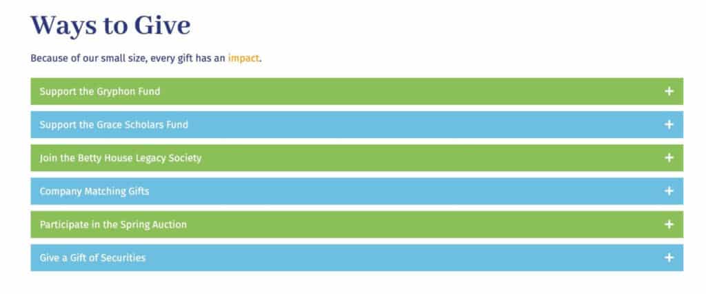
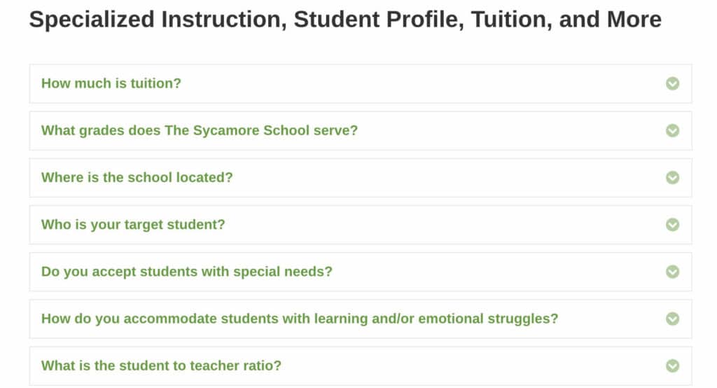
Here are some examples of accordion designs on school and nonprofit websites:
Why accordions are not always a good solution for content on your website
While they can make a web page easier to read, accordions should be used in moderation elements to describe situations or deliver information clearly. If users need to see most or all of the information on a page, it is better to use well-formatted text instead.
The Nielsen Group points out the following risks associated with accordion design, to keep in mind when considering their use on a website.
- Forcing people to click on headings one at a time to display full content can be cumbersome, especially if there are many topics on the list that individuals care about. If people need to open the majority of subtopics to have their questions answered or to get the full story then an accordion is not the way to go. In this situation, it’s better to expose all the content at once. It is easier to scroll down the page than to decide which heading to click on. (Every single decision, no matter how minor or how easy, adds cognitive load.) The experience feels less fragmented with fewer attention switches.
- Accordions increase interaction cost. Readers treat clicks like currency: they don’t mind spending it if the click is worthwhile and has value. However, resentment ensues when a click is considered a wasted effort; it doesn’t take many wasted clicks to escalate people’s reaction to full-blown defiance. Acquiring click targets, such as links and buttons, and waiting for content to appear requires work and wastes precious time that users don’t want to give.
- Hiding content behind navigation diminishes people’s awareness of it. An extra step is required to see the information. Headings and titles must be descriptive and enticing enough to motivate people to “spend” clicks on them. When content is hidden, people might ignore information.
- Accessibility is an important consideration. Pages and widgets must be coded with accessibility in mind, which is an added development effort. In contrast, plain text is inherently accessible (though it can definitely be too complicated for disabled users to understand, but that’s a standard writing issue which you should consider in any case.)
- Printing is another consideration that a reader correctly points out. Accordions are often not well suited for printing documents and require people to print snippets of content at a time. Make sure to optimize your pages for printing.
Before using accordions on your website, be sure to consider the pros and cons, and explore the best ways to present your content in a way that makes it easy for visitors to scan your information without being overwhelmed.
Need help? We are here to consult with you and review your content, or help implement accordions or content improvements on your WordPress website.
Contact us today for a free consultation.
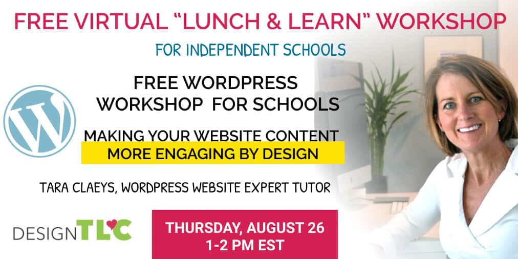
Want to learn more ways to make your website content more engaging by design?