What Makes a Good Nonprofit Website
Contrary to popular belief, a good non-profit website doesn’t need to cost tens of thousands of dollars; however, it needs to be functional, easy to navigate, and eye-catching for your audiences. There are several elements that are included in the formula of a strong non-profit website.
To build a solid, functioning non-profit website, you must understand the needs of your audience. What problems will your website solve for your donors and volunteers? What information do they need? How will you communicate that information?
On your non-profit website, donors, volunteers, and community members want to see:
- Your non-profit mission
- How their donations and volunteer time impact the mission
- Your reputation in your community
It’s important that the design elements and content on your website portray these three things. In this blog post, we’ll dig into how you can make that happen.
A good nonfprofit website makes the donation process easy
It’s simple— if potential donors run into difficulties making a donation, they’ll be less likely to follow through and actually donate. You want your donation process to be quick, easy, and efficient. Two aspects of gaining more success with your online donations for a good nonprofit website is creating an obvious call to action button and streamlining the donation process.
For example, make a “Donate Now” button visible to site visitors on every page. When they click the button, they should be taken directly to a simple form that is easy and quick to fill out— boom! Donation complete. This process of donating should be fast. You can mimic the experience of paying for an online shopping order so the process is familiar to donors.
If you’re starting from square one with your donation forms, ask yourself these questions about your current donation process:
- Does your website have an SSL to provide security and trust with your website visitors?
- Is it easy for website visitors to find your online donation form?
- Is your website mobile friendly and is it easy to make a donation from a phone?
- Does your website load quickly so visitors don’t get frustrated and leave before completing their donation?
- Does your donation form offer recurring donations?
- Does your donation form properly total and display donation amounts?
- Are donations properly processed through your payment processor? Do you offer a fee recovery option to allow donors to cover the processing costs (and does your form accurately compute these fees?)
- Do you get notifications when a donation is made?
- Does the donor receive an email receipt and thank you message after their donation is processed?
Use a strong Call to Action
For your non-profit website to be successful in its mission, you need to have text on your site promoting action. If you don’t, you’re missing out on donations, volunteer sign-ups, engaged community members, and more.
Include a call to action with a compelling donor-centric headline in the “hero/intro section” of your website homepage, in addition to a call to action in the header at the top of your site. Good calls to action include:
- “Support your community today”
- “Make a donation”
- “Change a child’s life”
- “Support our school”
- “Join our cause”
Check out two great examples of strong Calls to Action below:
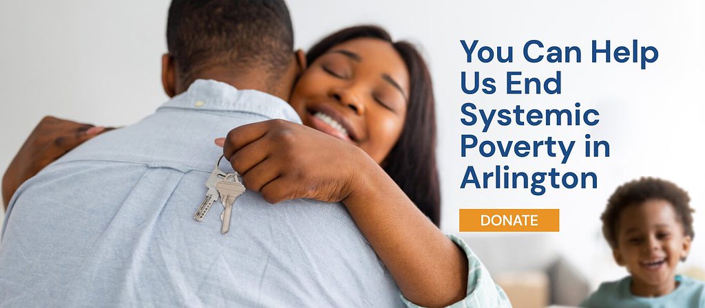
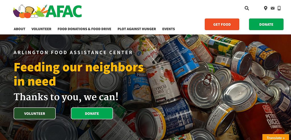
It’s good practice to plug your call to action in an easily recognizable spot on each webpage – this is often in the upper right of the header – so site visitors can see it no matter where they are on your non-profit website.
Prioritize user experience for a good nonprofit website
For your non-profit website to serve your visitors as it should, it must prioritize the user experience. How easy is it for your users to scroll through your site? Find the information they are looking for?
When looking at user experience in a good non-profit website, there are four main categories to consider:
- Easy to navigate
- Make your non-profit website’s navigation easy to use and familiar for site visitors. Your website should be clearly labeled with navigation menus stating exactly what the user is looking for: Home, About, Donate, Contact, Events, etc. Keep your information easily accessible and readily available for all users.
- Make your non-profit website’s navigation easy to use and familiar for site visitors. Your website should be clearly labeled with navigation menus stating exactly what the user is looking for: Home, About, Donate, Contact, Events, etc. Keep your information easily accessible and readily available for all users.
- Easy to read
- Keep your language simple. It’s important to remember that all website content should stay around a 6th grade reading level, so it is accessible for all website users, most of whom scroll quickly through website pages.
- Keep your language simple. It’s important to remember that all website content should stay around a 6th grade reading level, so it is accessible for all website users, most of whom scroll quickly through website pages.
- Fast loading
- Nothing is more frustrating for a site user than a website that takes too long to load. This would be especially annoying for someone trying to make a donation or signing up to volunteer! A slow loading site will easily deter website users from exploring further. There are tests you can complete to check your site speed, and you should make sure your website theme and multimedia elements like photos and videos are optimized for site speed as well.
- Nothing is more frustrating for a site user than a website that takes too long to load. This would be especially annoying for someone trying to make a donation or signing up to volunteer! A slow loading site will easily deter website users from exploring further. There are tests you can complete to check your site speed, and you should make sure your website theme and multimedia elements like photos and videos are optimized for site speed as well.
- Mobile friendly
- Society is on the go more and more each day— make sure your non-profit website can support mobile traffic! Ensure your website is as mobile friendly as it is desktop friendly. Space on a small and tall screen needs to feature your premium content that is easily navigated and clickable. Think strategically about how your audiences would use your website on a mobile device and incorporate that in your design.

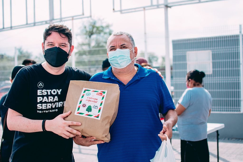
Incorporate imagery and testimonials
A good non-profit website is full of creative elements that portray the communities your non-profit serves. To ensure you are checking this box when designing your non-profit website, include as much high quality imagery as you can.
Imagery can be in the form of fresh photography, infographics, social media graphics, even video and other multimedia elements. Include photos of volunteers completing a project, a recent fundraising event, or people who have been positively impacted by your cause (with their permission). For a good non-profit website, strong imagery can make the website more personable and heart-warming, which can increase donations or volunteer signups.
Another tactic is to create a space on your website for testimonials. These testimonials can either be quotes from donors, volunteers, or folks in your community. Hearing directly from people who already work for your non-profit is a good way to attract new donors and volunteers.
Contact Us
Ready to take your non-profit website to the next level? Contact us TODAY for a FREE 15-minute consultation!