Taking and Selecting Great Photos for Your Website
Today’s post is from guest blogger Lawrence Cheng, of Lawrence Cheng Photography. Lawrence is a professional photographer based in Arlington, VA who specializes in portraits and corporate photography.
You’re probably aware that images do increase traffic to your website or social media feed. How much more traffic? Jeff Bullas, social marketing expert, cites the following statistics:
- Articles with images get 94% more total views
- 60% of consumers are more likely to consider or contact a business when an image shows up in local search results
- In an e-commerce site, 67% of consumers say the quality of a product image is “very important” in selecting and purchasing a product
It stands to reason that you should put in quality time and effort when making or selecting these photos. I always consider these three factors:
Size
Google reports that more than half of online traffic now occurs on mobile devices. This is great: mobile devices are portable, can be accessed anywhere, and increase traffic. The bad news is that they’re small: tablet screens range are about 7 to 10 inches wide, while smartphone screens measure 3 to 5 inches in size. This can make images feel distinctly cramped.
To make photos stand out on the small screen, follow these principles:
- Emphasize the main subject. You can make the subject brighter than the background, choose a bold foreground color, or crop closely to reduce or eliminate background clutter.
- Choose simple, graphic photos. Complexity doesn’t “read” well when the image is physically small; your eye naturally seeks and locks into a strong visual cue.

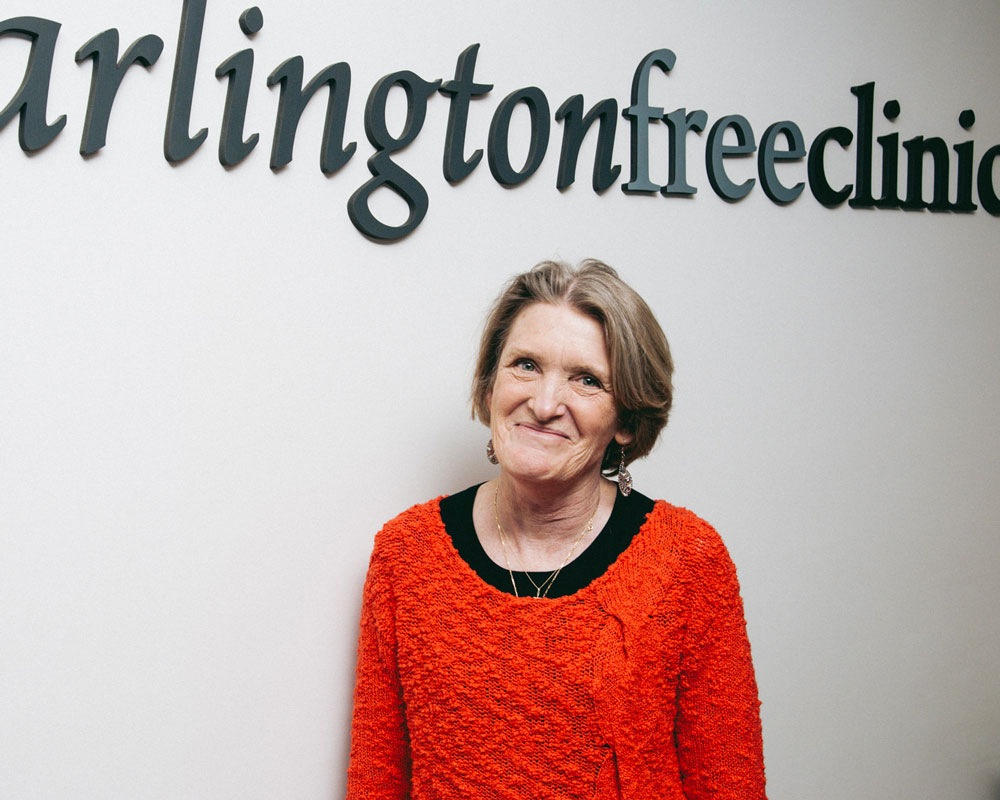
Arlington Free Clinic volunteer Sharon Golden really stands out in this photo because of her gaze, her red sweater, and her position within the frame.
Lighting
I try to take photos using good-quality light; by that, I mean a light source that is bright, has a broad color spectrum, and is shaped the way that I need for the photo. Sunlight is great, as it produces the most natural colors. Indoor lighting, especially fluorescent and LED lamps, is not so good – skin tones usually appear pale and sickly. I often employ flash to increase brightness and get better colors, but I never use the little pop-up flash on a camera. Instead, I set up one or more flashes around the subject, with reflectors or diffusers to soften the light and achieve the lighting shape that I need.
Flash can be tricky to set up, so I advise most amateurs to shoot with natural light: window light or outdoors in the open shade both work really well. Be careful on cloudy or overcast days, as colors tend to turn muddy.

Sunlight filtering through thin clouds provides perfect lighting for this portrait of GVI’s Curtis Crowley.
Color palette
Small images “pop” better with a limited color palette. If possible, work with your graphic designer to match your photos’ colors with those of the website. Adhering to a specific color palette also makes your images more consistent with each another, which in turn makes your site appear more professional.
Don’t forget to white-balance your photos. (White-balance is the process of adjusting the tone of an image so that whites and grays appear truly neutral, not too warm or too cool.) Unfortunately I often see uncorrected photos being used in small-business websites; and poor editing of images brings down the perceived quality of any site. I begin each photoshoot by photographing a color chart, which I then use in post-processing to ensure consistency among my photos, even if I shoot on different days.

A bold combination of colors in this photo of AFC’s Margie Badman: the pink and orange hues are split-complementary colors to Margie’s blue-green sweater.
Resources
I can’t recommend this book enough: “Read This If You Want to Take Great Photographs,” by Henry Carroll.
The best way to improve your photography is to learn to see like an artist. View this beautifully-produced video featuring renowned designer and educator, Inge Druckrey.
