
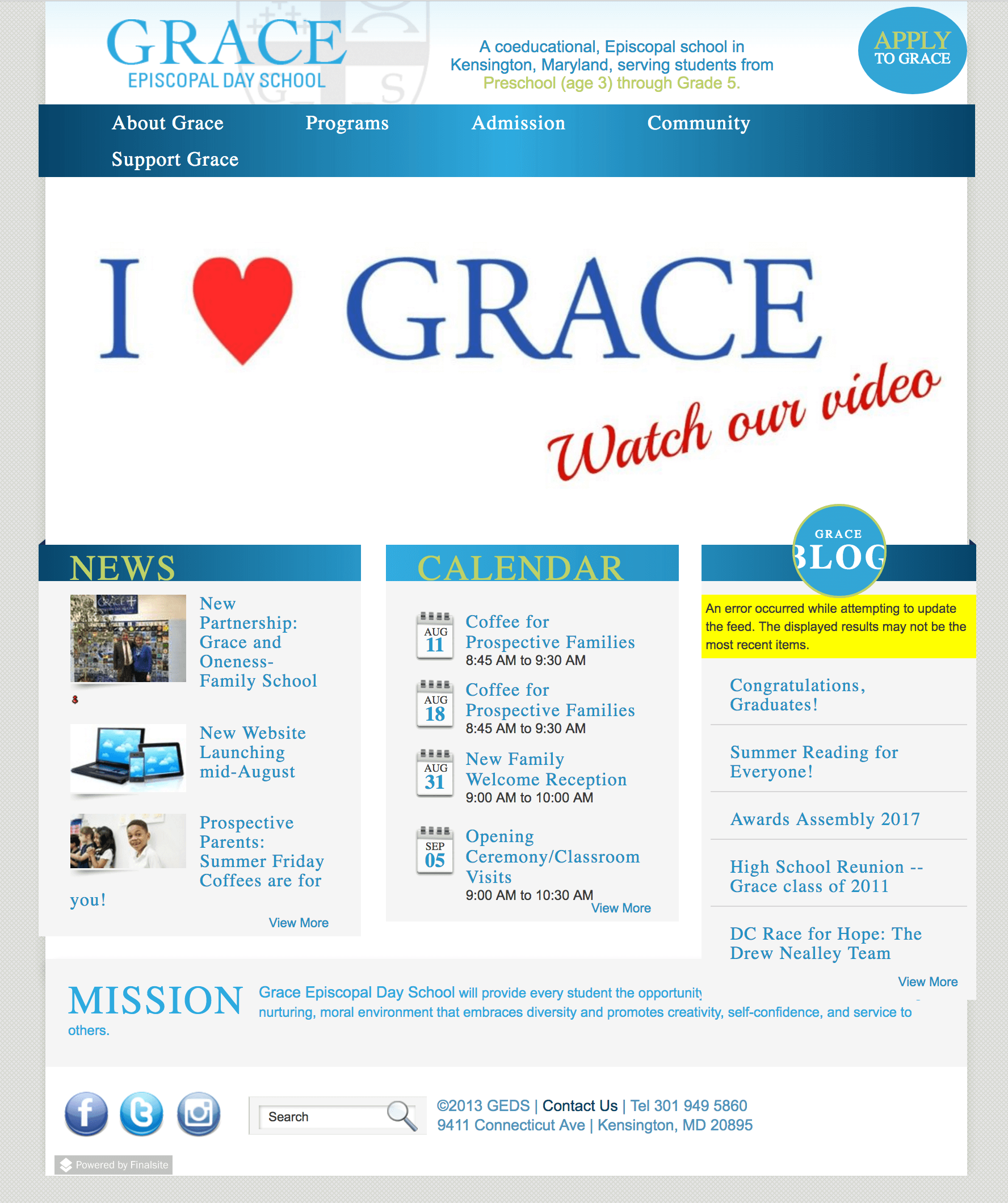
Design TLC recently launched a new website for Grace Episcopal Day School, a private school in Kensington, Maryland. Their old site was built with the 3rd party school management system, Finalsite. It was out of date, was not mobile responsive, and was very hard for the school administration to update.
The new website was created using WordPress and Beaver Builder. The result is a performant, clean and effective website that conveys the message and personality of the school, while also functioning well for users and administrators.

MEGA MENU
One of the key features of this website is the “Mega Menu.” The Information Architecture for this site was fairly large, and to improve the user experience, a mega menu was a good option. Mega menus are often used on websites to make navigation easier and more informative. There are a few WordPress plugins that create mega menus and offer a variety of style options.
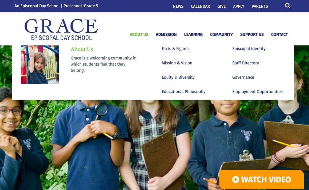
For this website, since it uses using Beaver Builder, we did not need a mega menu plugin. Beaver Builder has built-in functionality for a “mega menu.” They explain the set up here, using preset css classes in the WordPress Menu Admin. This mega menu is a horizontal menu structure with columns. Out of the box it creates a simple mega menu. However, for this website, we needed to add a photo in each mega menu, as well as some intro text before listing the pages in the dropdown navigation menu.
Luckily, David Waumsley’s website takes Beaver Builder’s Mega Menu a step further with his “Mega Menu Extended” Tutorial and Script here.
This is the code provided by David, which is placed in my theme’s functions.php file. I did not use all the code he provides in his website above. For example, I did not need to make my menu full width and did not need the shortcode functionality.
I added my own css code to match my design for the photo and intro section. You can see the how these classes are applied further down below. Here is the css I created for the image, header and intro text in the Mega Menu (apologies for use of !important):
Once the code has been added to the theme, the menu can be built. First make sure to have the Menu Screen Options set to show the CSS Class and the Description.

Here is my setup:
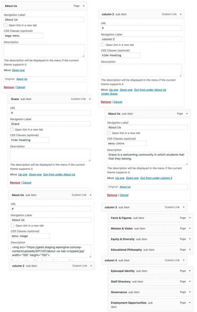
First, the Beaver Builder Class “mega-menu” gets applied to the top level item.
Next, I wanted an image in the first column on the left. I did not need this to link to anything. It needed to have a label so I could identify it, but I didn’t want the heading to show, so I used the Beaver Builder class “hide-heading” for this. In the description area, I added the source and size for the image.
In the second column, to the right of the image, I wanted a short intro sentence, with a heading above it that links to the page. I gave this the navigation label of “column 2” to keep things organized. I also used the “hide-heading” class for this item, as I did not want a “heading.” This item is really just a way to set up the column. Under this, I placed a sub-item Page (About Us), with the navigation label “About Us,” the css class I created called “menu-intro” and a the text in the Description area.
For the third and subsequent columns, I created additional “blank” menu items to identify the columns, and then placed the sub-item Pages under each column. Note: occasionally, the page content will auto-fill into the Description area when adding a page to the menu. You can just delete this content.
Beaver Themer & Mobile Menu

I used the Beaver Themer plugin to create the header(s) for this website. The desktop version of the site uses the mega menu, but the mobile version of the header has some custom buttons that highlight the “Apply” and “News” links above the mobile Toggle Menu. This menu does not include a mega menu, which obviously would not be appropriate for a mobile device.
Beaver Themer makes it easy to set visibility for header components such as menus. In this case, I have two menus in the header, one which shows on large devices (breakpoints are set in the main Beaver Builder Global Settings), and another which only shows on medium and small devices.

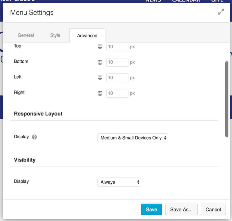
Beaver Themer was also used to create the footer, although this was more straight-forward so did not require multiple menu versions.
With some custom css, patience and determination, you can do amazing things with Beaver Builder!