Ensuring Accessibility: A Guide to Creating an Inclusive Private School Website
In today's digital age, a school's website serves as its virtual front door, offering vital information to prospective parents and students. However, to truly welcome and engage all visitors, including those with disabilities, the website must be accessible. Accessibility isn't just about complying with regulations; it's about fostering inclusivity and ensuring everyone can access the information they need.
Section 508 of the Rehabilitation Act mandates that electronic and information technology (EIT), including websites, be accessible to individuals with disabilities. Although private schools don't generally receive government funds, which creates a legal obligation to meet the standards outlined in Section 508, educational institutions have an ethical obligation to promote diversity, equity, and inclusion within their communities. Ensuring your website is accessible to individuals with disabilities aligns with these values and reflects a commitment to social responsibility.
Where Do I Begin?
Private school marketing departments are often stretched thin as it is. You may be thinking, 'How do I add another thing to my To-Do list?' and 'Is this really necessary?' It is, and there are several ways you can go about it.
Understand Accessibility Guidelines: First, familiarize yourself with accessibility standards such as the Web Content Accessibility Guidelines (WCAG) to ensure your website meets recognized criteria for accessibility. The WCAG is part of a series of web accessibility guidelines published by the Web Accessibility Initiative of the World Wide Web Consortium, the main international standards organization for the Internet.
Check with your Web Provider: Does your web provider or content management system offer an accessibility tool? Explore the resources and cost to evaluate your website.
Consider the Purchase of an Accessibility Tool: Many tools are available that can help you scan and revise your website's back end. Explore a few and see what's best for you. At Design TLC, we use a fantastic Accessibility Checker from Equalize Digital that identifies errors and warnings so we can easily address them. Avoid using “quick fix” widgets and overlays, which are not preferred by people with accessibility needs and can often make website harder, not easier, for them to use.
Find an Accessibility Partner: Consider hiring an accessibility partner. Design TLC prioritizes the obligation of maximizing website accessibility for all school websites to comply with legal standards and promote a more inclusive online environment. We scan and assess your website for accessibility compliance and make the necessary changes to maximize usability.
What Constitutes a Compliant Website?
Many areas determine a website's accessibility, including:
- Use “alt text” on images. A blind or visually impaired person cannot understand the content and purpose of images, including photos, illustrations, and charts if the alternative text is unavailable. "Alt text" conveys the content of an image. Use the same information that a sighted person might gather about the image. This might include information about a person's race, ethnicity, gender, age, other distinguishing features, and a description of what is happening in the photo. Alt text can be valuable for individuals who are blind or visually impaired. (i.e., an Asian boy working with a white girl to build a tower in second-grade STEM class.)
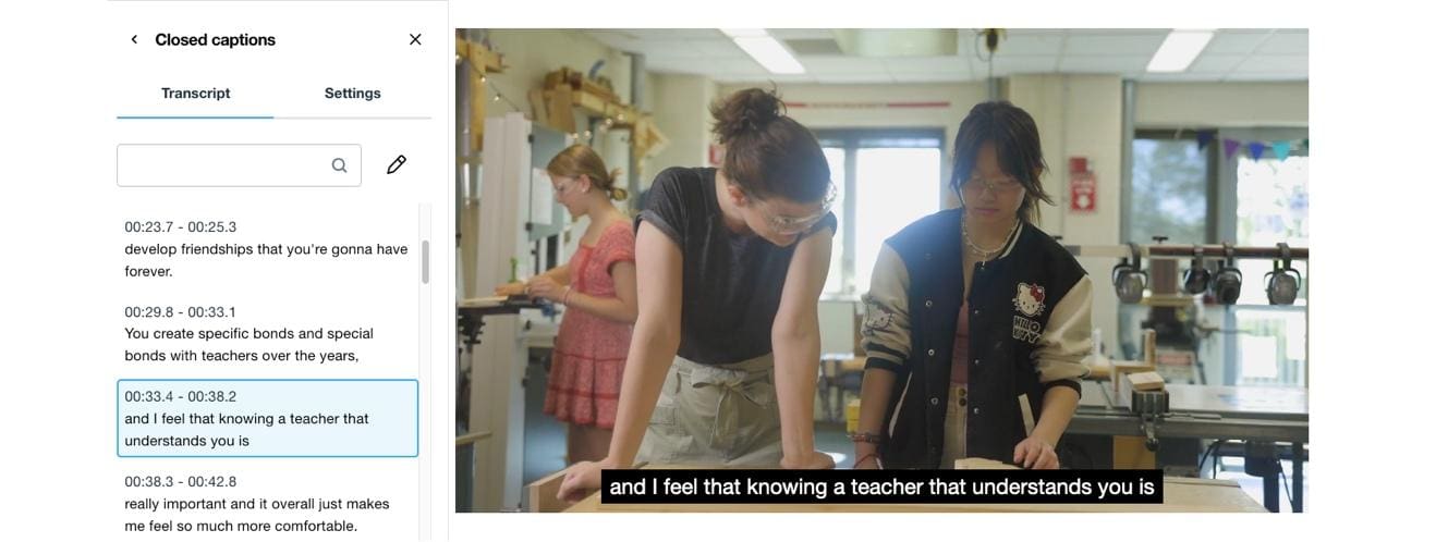
- Provide transcripts and captions. To accommodate users with hearing impairments, offer transcripts for audio content and captions for videos. This ensures that all users can access the information presented in multimedia formats.

- Use appropriate color contrast. People with limited vision or color blindness cannot read the text if there is insufficient contrast between the text and the background. Color combinations should meet the minimum color contrast ratio of 4.5:1. To determine color contrast ratio, you will need to find the hexadecimal codes of your foreground and background color and test them using a color contrast checker.

- Avoid the use of color alone to convey information. Screen readers do not tell the user the text color on a screen. If you use color to convey certain information (i.e., using red text to indicate required fields on a form without using the word "required,"), a blind person would not be aware of the meaning of the colored text. Color-blind people cannot distinguish specific colors from others and may not have access to information when that information is conveyed using only color cues.
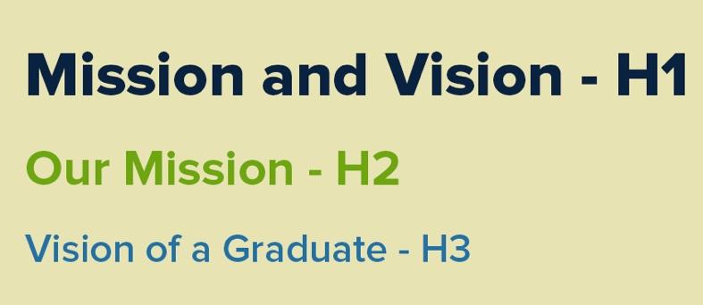
- Using headings in correct descending order. The heading elements should be organized in descending order without skipping a level. For example, an h4 should only come after an h3. Skipping heading levels will cause screen readers to jump around your web page leaving users to wondering if some content is missing.

- Avoid Links Opening in New Tab. Be discerning in the use of opening links in a new tab as visually impaired users may not be aware this has occurred. Use an available plugin to create an audio alert when you must open a link in a new tab.
- Text Too Small. Ensure that all text elements on your website are at least 10 points so that it can be more easily read without a user needing to zoom in on their browser.
- Avoid Ambiguous Anchor Text. Ambiguous Anchor Text errors appear when linked text has no meaning outside of its surrounding content. Common examples of this include linking phrases like "click here" or "learn more." To resolve this error, change the link text to be less generic so that it has meaning if heard on its own. (i.e., Learn More about our Early Childhood Program instead of Learn More) or use a special css class to add this information that will be visible to screen readers only (if you know code it looks like this: <a href=”yourlink.com”>Learn more <span class=”sr-only”> about our early education program</span></a>)
- Create accessible online forms. Provide adequate information to make forms full accessible such as:
- Clear instructions at the top of the form.
- Labels that screen readers can convey to the user for each field.
- The word “required” next to each field that must be completed as opposed to an asterisk or color indication.
- Error indicators such as an audible alert telling the user a form field is missing or incorrect.
- Implement Keyboard Accessibility. Ensure all website functions and navigation can be accessed using a keyboard alone. Users with motor impairments rely on keyboard navigation, so ensure all interactive elements are easily reachable and operable.
- Responsive Design. Ensure your website is responsive across devices and screen sizes. Responsive design accommodates users who may access your website on various devices, including smartphones and tablets.
Maintaining Accessibility
Once you've completed your initial audit and taken steps to maximize accessibility, you can take several steps to ensure that your website's accessibility remains a priority.
Conduct Regular Accessibility Audits: Regularly audit your website for accessibility compliance and address any issues promptly. Accessibility should be an ongoing process, with continuous improvements based on user feedback and evolving standards.
Educate Staff and Content Creators: Train staff and content creators on accessibility best practices to ensure that new content is created with accessibility in mind. Encourage a culture of accessibility throughout your organization.
Solicit Feedback from Users: Actively seek feedback from users, including those with disabilities, to identify areas for improvement and ensure your website effectively meets their needs.
Stay Informed on Accessibility Trends: Stay updated on emerging accessibility trends and technologies to continuously enhance your website's accessibility and provide the best user experience for all visitors.
Conclusion
Creating an accessible website for your private school is a moral imperative. By following these steps and prioritizing inclusivity, you can ensure that all prospective parents and students can access the information they need and feel welcome within your school community. Let's strive to build a digital environment where everyone feels valued and included.