Christ Episcopal School

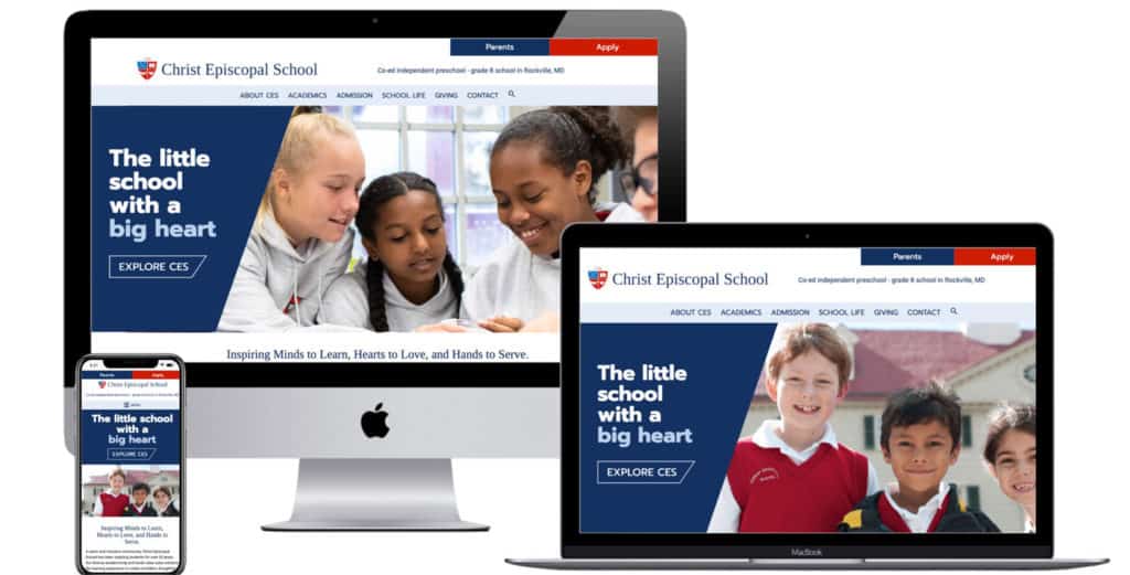
Christ Episcopal School in Rockville, Maryland is a small private school with a big heart! The school community is tight-knit and has reinvented itself in recent years. Their new director has a vision for the school which includes a new, brighter website and overall look and branding, which better reflects the school character.
New Logo and Color Palette
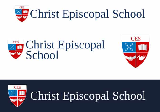
We started with a refresh of the color palette, logo and shield.

New color palette and logo:


New Website
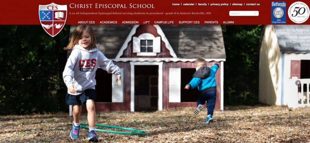
The old website was built on a proprietary CMS which was out of date and hard to edit. The navigation was a bit overwhelming, and needed to be reorganized and streamlined.


It was a delight to work with the team at Christ Episcopal School! We look forward to seeing how the new website helps CES engage with their community, get found on the web by prospective families, and provide new inquiries for incoming families.
Objective
Refresh the School’s Branding
- Redesign the logo, shield, and color palette to create a more cheerful, friendly, and professional identity that aligns with the school’s character.
Build a Modern, Easy-to-Manage Website
- Replace the outdated proprietary CMS with a WordPress site that is easy to navigate, easy to edit, and reflects the joyful spirit of the school community.
- Streamline the site architecture and make internal page navigation simpler and more intuitive.
Empower the School for Ongoing Success
- Incorporate SEO keyword research into page content and meta descriptions to help improve search visibility and website traffic.
- Provide a well-organized backend and clear training tools to allow the school to easily maintain their website after launch.
Approach
Logo and Color Palette Redesign
- We started with a refresh of the color palette, logo and shield. The color palette was dark and the logo was not a vector format, which made it look blurry and hard to read. The icon/shield had a lot of drop shadows and too much detail for a small space. It also had a “police shield” shape which didn’t feel friendly.
- The Episcopal Church colors include a cheerful blue and red. We updated the shield to remove the drop shadows and simplify the icons. We squared off the top and replaced the maroon in their former shield with a brighter red that is close to the Episcopal red.
- We chose a serif font that had a unique squared serif to create a balance with a traditional and modern look.
Website Redesign and Development
- We replaced the outdated proprietary CMS with a modern WordPress website.
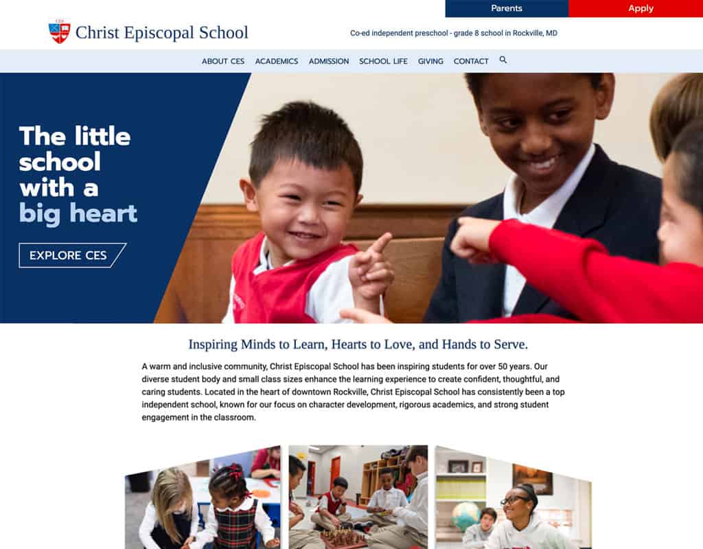
- When we asked the team at the school to describe their school’s personality and unique selling point, more than one person described the school as a “happy place.” They wanted a “Wow!” website! We came up with a design that helped to feature a happy feeling, and which is unique and easy to navigate.
- We streamlined the navigation and created sidebar menus and breadcrumbs for easy browsing within each section.
Content Development and SEO Strategy
- We organized the content workflow using Google Docs for efficient collaboration and quick turnaround.
- Content was formatted with subheads, accordions, and tables to improve readability and user engagement.
- We incorporated SEO keyword research into page content and custom meta descriptions.
Backend Organization and Client Training
- We made sure the pages are well organized, and we put written Website Instructions within the WordPress Dashboard, with screenshots and videos to help them with any editing after launch, so editing and keeping the website updated is a snap!
Outcome
- Bright, Modern Visual Identity: Christ Episcopal School now has a refreshed brand that feels welcoming, joyful, and professional.
- User-Friendly, Engaging Website: The new WordPress site is easy to navigate, beautifully designed, and reflective of the school’s vibrant community.
- Improved SEO and Online Visibility: The site is optimized with targeted keywords and metadata, setting the foundation for better search engine rankings and more inquiries.
- Streamlined Content Management: With a well-organized backend and thorough instructions, the school can easily update and maintain their new website.
- Stronger Community Engagement: The new website positions Christ Episcopal School to connect more effectively with their existing families and attract new prospective families.