3 Practical Ways To Have Good UX AND “Cool” Design
I have recently been debating the conflict between creative, unique and “cool” website design and a good, effective user experience. As Steve Krug says in his book, Don’t Make Me Think: A Common Sense Approach to Web Usability, “The Farmer and the Cowhand Can Be Friends” (shout out to my fellow fans of musical theater!).
On a recent project, my super-talented design partner presented a cool interactive infographic that our client fell in love with. Once we began to flesh out how to make it work, I was faced not only with the challenge of how to develop/code this element, but also whether the interactivity would be 1) effective and 2) accessible.
I did some research, including reaching out to some well-known UX “experts” for their general thoughts on the subject. Morten Rand-Hendriksen, of Lynda.com, often speaks about website interaction and user experience. He stresses the importance of clear communication to ensure the user knows how to interact with important elements on a website. A good user experience is aided by words to describe the desired action (e.g., “click here”). However, words alone cannot always accomplish a clear message, for there still must be some way of knowing what the action is and where it is to be done. This requires a convention of highlighting, outlining, or depicting an actionable object.
Affordance Theory and Convention
Morten referred to “Affordance Theory,” when we spoke. This is a theory posited by American psychologist James Jerome Gibson which states that the world is perceived not only in terms of object shapes and spatial relationships but also in terms of possibilities for action (affordances). So, for example, an object with a handle, “affords” being picked up; buttons or dials that are raised or appear to be raised, “afford” being pushed or turned.
When affordances are taken advantage of, the user knows what to do just by looking; no picture, label, or instruction needed.
In large part, affordance in web design is related to Convention, or Pattern; what most users have learned over time and elements with which most users are familiar (ie links underlined in text).
However, as Don Norman (a cognitive scientist who studied under Gibson) writes, “Convention severely constrains creativity…. On the whole, however, unless we follow the major conventions, we are doomed to fail.” So how can a decorative and “cool” website element, with no convention preceding it, still produce an effective website user experience? As a developer, the “easy” way out is to stick with convention. As a designer, this results in potentially boring, non-creative websites. The farmer and the cowman …
I believe a good design must embrace creativity first, while also keeping in mind the following 3 considerations to make a “cool” website that is also user friendly:
CONSIDER THE TARGET AUDIENCE
 A website needs to create a great, visually appealing and engaging first impression. Without this, the question of user experience and interaction is a non-issue. If a visitor leaves a website because it is not engaging, it has failed before even getting out of the gate.
Of course, what is engaging to one person/audience may not be effective for a different demographic. In addition, the designer must consider the intention the the visitor has for coming to the website in order to serve a design and message in a way that meets or exceeds the visitor’s expectation for their interaction with the website.
Finally, with an increased focus on Accessibility, designers and developers must have in mind interaction that works not just for their target audience in general, but for those with disabilities. Unfortunately, this often means the “cool” features of a website cannot meet accessibility standards, in which case, a backup plan for this audience should be implemented.
I consulted with Carrie Dils about my interactive infographic. Carrie’s Utility Pro Theme is built to meet all accessibility standards. (*2018 update – Utility Pro is no longer available) Carrie’s response was that infographics can work, “as long as the same information is available without the infographic (i.e., support content around it).” She suggested that approaching the content from the standpoint of how to SEO the message of the infographic might also solve the accessibility issue at the same time.
CONSIDER CONVENTION/AFFORDANCE/COMMUNICATION
Based on your target audience, the patterns and conventions will vary. For example, a younger audience has more familiarity with shortcuts, icons and buttons, which may not be understood by an older audience.
 “Metaphors” like icons and buttons are common in web design. You need to be sure to understand the underlying meaning of a metaphor in order for it to communicate. While these elements can help communicate abstract ideas without much instruction, you risk alienating some percentage of your audience that doesn’t understand the metaphor.
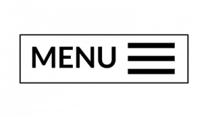
Pay attention to your Labels … for example, research shows a button with the word MENU inside was clicked by 20% more unique visitors than the HAMBURGER button containing no label/word.
TESTING
Steve Krug talks about the fact that website designers, developers and their clients tend to think that all users are like them. Debates about what people like waste time and drain a website team’s energy. Testing tends to defuse arguments and break impasses by moving the discussion away from the realm of what’s right or wrong and into the realm of what works or doesn’t work. And by opening our eyes to just how varied users’ motivations, perceptions, and responses are, testing makes it hard to keep thinking that all users are like us.
A few other things to keep in mind:
Mobile Responsiveness
In addition to these three things, as with any website, whatever “cool” features are added to a website must take into account how they will work on a mobile device. This website does some pretty neat stuff on a desktop, but is also able to simply serve the content on a mobile device effectively:
This website has fantastic interactive graphics and animation, and the sounds correspond well to the actions, but the website does not fit on a mobile screen, and the content is hard to read on a phone. (Also, the sounds that play on the desktop version are cool, but may be annoying for some users)
Site Speed
A “cool” website with lots of bells and whistles may have a trade off in site speed. Depending on the intent of the website and the target audience, the trade off for a cool graphic element may not be worth it if the website loads too slowly and visitors leave before the design and content is in view!
DOES THIS MEAN DESIGN HAS TO BE “SOULLESS?”
Neil Cooper of SapientNitro says that Web design is losing its soul to “vacuous, soulless containers.” He claims there is an overemphasis on UX, but I would argue that, as noted in #1 above, this depends on the target audience. UX might be the primary goal that does limit design in some cases, if an audience needs very clear and specific direction, which relies heavily on convention and pattern, in which case great design is possible, but will definitely be limited.
I think a good process is to start with a “blue sky” vision from a creative designer who takes into account the target audience and their intent. A good team involves this designer and a developer who can interpret the design and advise on how to make it effective and accessible. Ideally the next step is to test the concept/design.
Despite my constant search, there are no “right” answers for most web design questions … after all, users are different and approach websites in a myriad of ways. What works is thoughtful design that fills a need and is well executed, and tested.
Giddy Up! Share your thoughts and opinions below!